|
Office Furniture |
What you must know: How to choose the office screen card position
With the improvement of living standards, people have more and more needs for the overall office environment, especially the office environment. A good office atmosphere and environment can make people happy and get twice the result with half the effort; but how to create a good office environment? To choose a suitable office screen card position.
In modern companies, most of the employees consider office screen card positions, especially for some large companies and new enterprises. Compared with the previous desks, the design of card positions is more reasonable, which can accommodate more employees and is more beneficial for employees to work. , and a wide range of styles, novel designs, and more choices. So how to choose the office screen card position? Guan Xiaomei will tell you~
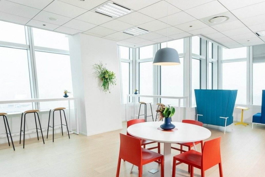
1. Office screen office furniture is mainly used in open office areas
The direct function of the screen card position is to separate the space, while the medium-height screen only partially and relatively separates the space. The main significance of the screen in the open office area is to create a relatively independent private work space without affecting communication, reduce mutual interference, improve office efficiency, facilitate management, and create conditions for team communication and collaboration.
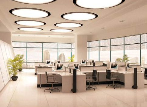
2. The structure should be reasonable, and it should be easy to install and disassemble.
To check whether the screen is reasonable, you can shake the screen with your hand first to see if it is firm. A reasonable structure is very easy to install and disassemble. Many products developed by office screen factories do not understand screens and structures. Speaking of the products developed by today's designers, they are very beautiful and practical.
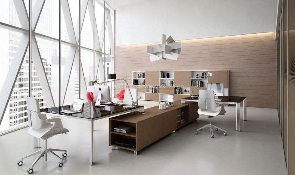
3. The aluminum material and thickness of the screen should be ideal
The material and thickness of the aluminum material of the screen should be very ideal. Generally, the high-quality aluminum material used for the aluminum material can be seen in the incision. Secondly, the thickness is also very easy to see when the incision is made. It can be measured with a vernier caliper. The thickness should be A relatively thick aluminum material can be considered to be more than 1.0mm. The connection method of the screen should be reasonable, usually self-tapping screws. Look at the thickness of the aluminum.
4. Selection of screen height
The relationship between the height of the screen and the space it separates: a relatively high screen is used to separate a relatively large space, and a relatively low screen is used to separate a relatively small space; if a relatively high screen is used in a small work space, there will be a sense of oppression.
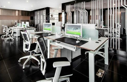
5. Application of screen color
The focus is on the relationship between the choice of heating and cooling and the sense of space. The cool color of the office screen has a better sense of space, which makes people feel that the remaining space is larger; the warm color is the opposite. It can be seen that cool colors are widely used, while warm colors are not suitable for relatively compact working spaces with relatively small per capita space. Neutral tones are the most widely used, and the advantage is that they are more harmonious no matter where they are applied. Different shades express different emotional appeals. Guanmei office furniture reminds you that when choosing the color of the office screen, you should pay attention to the selection according to the style of the company, the LOGO and the corporate culture.
Warm colors make people feel warm and unrestrained, friendly and energetic; the disadvantage is that it is a bit noisy and not serious enough. Cool colors make people feel calm and refreshing, but the disadvantage is that there are many applications, and many colors lack personalization. Neutral tones feel more solemn and serious, expressing a rational and rigorous culture, but the disadvantage is the lack of emotional color. For large-area color applications, it is advisable to apply color combinations to avoid monotony.


